A window hand-painted with looping letters was once the hallmark of Amsterdam’s most characterful cafés. Now the craft is having a revival, thanks to a new generation of young painters
On a sun-trap corner adjacent to the stately Prince’s Canal, Café de Eland is also the archetypal Amsterdam bruine kroeg, or brown café, a charmingly outdated type of neighbourhood pub that gets its name from the shades of brown that years of tobacco smoke have left behind. It’s at such places, surrounded by ramshackle furniture and stained oil paintings, that lovers meet, neighbours share gossip and old-time Amsterdammers tell their stories. Steeped in the working-class history of the Jordaan, Eland’s wood-panelled walls, jolly red-and-green striped canopy and candlelit tables epitomise the much-prized Dutch virtue of gezelligheid, or cosiness.
But few visitors realise that the café also bears one of the city’s other emblematic features: the Amsterdamse krulletter, a curlicued script that graces its glass window and the façades of dozens of brown cafés across the Jordaan and De Pijp, the so-called Latin Quarter, where the streets are named after Dutch painters. The style was first developed in the 1940s by Wim Visser, the in-house painter of the city’s Amstel brewery, and has proven so distinctive, it became the subject of a 2015 book-length research project by Argentinian typographic expert Ramiro Espinoza.

During his exhaustive research, Espinoza analysed photographs from Amsterdam’s City Archives, family documents and colleagues’ testimony to establish that Visser had adapted his Amsterdamse krulletter from the late cancelleresca style practiced by writing masters during the Dutch Golden Age. “They provided the inspiration for the basic structure of the capital letters, the raindrop- or lobe-shaped upper extremities of the letters, the lower case ‘d’ with a left-leaning ascending stroke and the spiralling swashes, among other characteristics,” writes Espinoza. Certainly, Visser’s krulletters conjure something of the proud extravagance of Amsterdam’s 17th-century glory days.
Such historic styles rarely stand the test of time, replaced as they often are by more modern modes of typography, and so it was very nearly the case in Amsterdam; but the very fact that krulletter can still be found around the city is testament to a number of passionate men (and women) of letters.
Sign-painting has almost completely died out as a profession. To make matters worse, glass is, of course, susceptible to breakage, so magnificent façades [are] being lost forever
But who are they? That story takes us back to Café de Eland. When current proprietor, Mark Bollen, took the keys in the 1980s, he knew the writing was on the wall for the old signage, a stiff and forbidding German-style relic from the 1930s. “The effect was Gothic and not at all in keeping with the atmosphere,” recalls Bollen, who is now 57.
As luck would have it, a fellow regular at Bollen’s own favourite bar across town in De Pijp was the then-fiftysomething Leo Beukeboom, “a very quiet and polite single man with a beard, who stuck to the same schedule every day” and could be found on any evening nursing a pint of Guinness or a glass of port. But to typographical connoisseurs today, including Espinoza, Beukeboom is something of a celebrity. The humble sign-painter carried on the precarious one-man typographical tradition of Wim Visser and has arguably exerted as strong an aesthetic influence over the city in which he was born as any artist. Bollen hired Beukeboom to paint a new sign for Café de Eland.
“It was amazing to see him paint the window,” says Bollen. As used to be common practice among sign-painters, Beukeboom drafted his typographical design on paper, perforating the bold sweep of the major letters using a handheld gadget called a pounce wheel. “He marked out a few lines using chalk, then he wrote the rest of the sign freehand over the course of an afternoon. I was immediately very happy with it, and customers have been admiring it ever since.”
Even as a very young man during the 1960s, Leonardus Petrus Beukeboom had been a prolific signwriter. After he took evening classes at the Amsterdamse Grafische School, now the Mediacollege Amsterdam, the mighty Heineken brewery hired him to provide signwriting services to the pubs that served its beer around town – a perk designed to ensure that the Heineken logo was prominently displayed. After Heineken acquired its competitor brewery Amstel in the late 1960s, Beukeboom found that bar owners would often ask him to recreate Visser’s style that they were accustomed to.
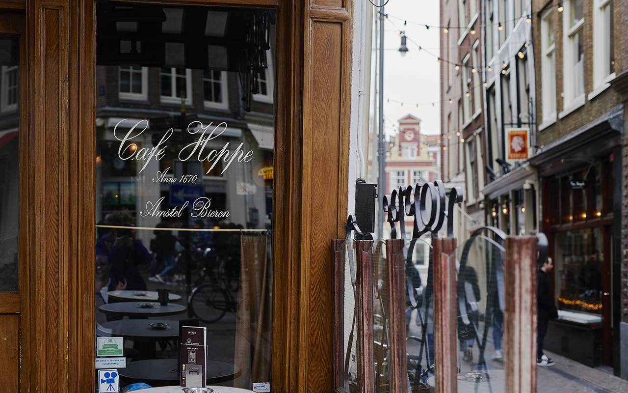
In learning to imitate Visser’s original style, Beukeboom became the guardian of the Amsterdamse krulletters, spreading the word to new areas of Amsterdam and, occasionally, further afield. There’s a whole chain of bars in Ghent, for example, bearing his handiwork. For Amsterdam bar owners and their loyal patrons, the script – which features idiosyncrasies such as a dot on the letter “i” resembling a leaf – became an indispensable part of the brown café aesthetic.
Those letters are a bit like the real Amsterdam people that you find drinking in the pubs of the Jordaan. They’re traditional and flamboyant at the same time
By 2015, however, breweries had long since stopped funding the expensive practice of hand-branding their pubs, and Espinoza was far from sanguine about the future of the art form. “Beukeboom had retired without an heir apparent,” says Espinoza today, “not least because sign-painting has almost completely died out as a profession. To make matters worse, glass is, of course, susceptible to breakage, so magnificent façades were being lost forever.”
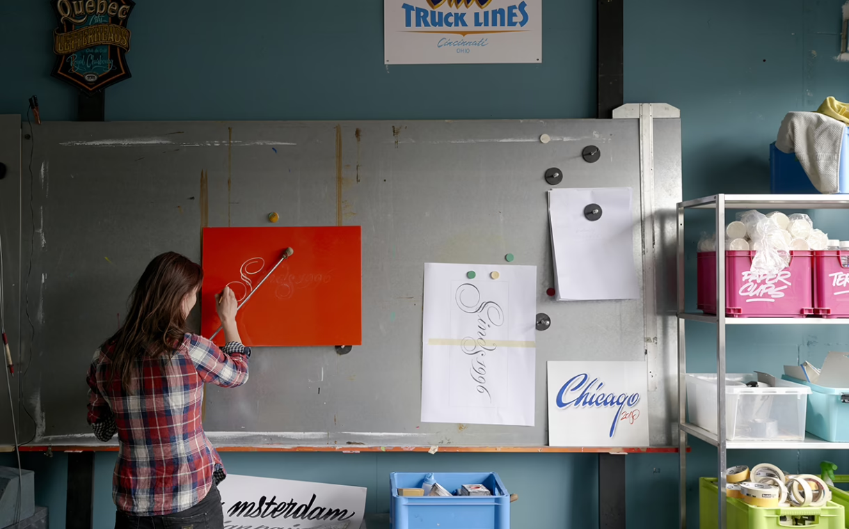
But just as Beukeboom had once stepped in to take up the mantle from Visser, a new generation of young craftspeople are endeavouring to continue one of the city’s most beloved traditions. Enter the Amsterdam Signpainters, a small collective of artists who met in 2014 at a workshop for sign-painters, calligraphers, pictorial artists and pinstripers who paint go-faster stripes on luxury cars. Having worked individually as desk-based graphic designers for high-level clients including Nike and the Van Gogh Museum, they saw an opportunity to provide a more personal form of handiwork for the new wave of cafés, restaurants and shops cutting a swathe across Amsterdam: namely, hand-painted signs. In 2016, they quit their day jobs and began offering artisanal services and workshops full-time. “After working mostly on computers since we graduated, this is a breath of fresh air – sometimes quite literally,” says sign-painter Jeroen Koning.
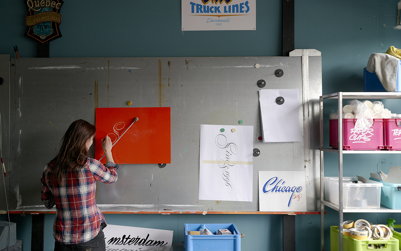
“There was a period of trial and error at first,” says his colleague Miranda Ensink, currently the group’s only female member, “but we’ve worked together to achieve really ambitious things in sign-painting, from smart letters in gold leaf to graffiti-style murals.”
The Signpainters range in age from 36 to 46 and look like any other band of MacBook-toting creatives around Amsterdam, except for their paint-daubed T-shirts and jeans. A typical job will see one of the Signpainters perched atop a stepladder for two days, during which they field questions from inquisitive passers-by. “I worked on a job recently where a grandfather kept bringing his granddaughter back to check up on my progress,” Ensink reports.
[sk_post id=”64397″]
As well as good people skills, a steady hand is, of course, a prerequisite, and some sign-painters use selfie sticks adapted into hand rests. With Espinoza’s book as their guide, the Signpainters began experimenting with the Amsterdamse krulletter, and in 2016, they took on their biggest job yet: hand-painting the words “sinds 1996” (“since 1996”) in krulletters on 33 shop windows across the Netherlands for the 20th anniversary of the Amsterdam-born chain, Coffeecompany.
“I think those letters are a bit like the real Amsterdam people that you find drinking in the pubs of the Jordaan,” says sign-painter Jasper Andries. “They’re both traditional and flamboyant at the same time.”
Established chains aside, the Amsterdam Signpainters have also received commissions from startups hoping to evoke a sense of the city’s social and aesthetic heritage. The same year, for example, they painted the sign for Proeflokaal ’t Kelkje, a new liquor dispensary serving traditional bitters, various eaux de vie and local gin predecessor genever by a canal in Amsterdam’s gentrifying red light district.
Zayne Dagher, a creative director at Design Bridge, a brand consultancy with offices around the world, is another satisfied customer, having commissioned the Signpainters to paint krulletters on the glass walls of the agency’s meeting rooms in Amsterdam. “As so many aspects of life become mechanised, we’re seeing a huge return to craft and hand-lettering because it feels so human in its imperfection and the krulletter is our very own local expression of that,” says Dagher. What’s more, she notes, the photogenic krulletter is finding newfound popularity on social media. “The sky or the trees reflected in the windows of a café with that elegant writing – it’s Instagram gold.”
– PHOTOGRAPHY BY JORDI HUISMAN
Please check the establishments’ respective websites for opening hours as well as booking and seating requirements before visiting, and remember to adhere to safe-distancing measures while out and about.
To learn more about Singapore Airlines flights, visit singaporeair.com. For updates and travel advisories, please visit Ministry of Foreign Affairs’ website.
This article was originally published in the May 2018 issue of SilverKris magazine